Voice input facilitates documentation - A hackathon topic
Voice input makes it possible to intuitively record food eaten and drunk without having to look at a device or tap. Instead of laboriously entering everything by hand, users can simply record their meals and snacks by voice command. This approach can lower the inhibition threshold and encourage users to continuously document their eating habits. This saves time and encourages regular documentation.
BlogVoice input facilitates documentation - A hackathon topic
Cayas Software GmbH plans a team event every year. This year it was a hackathon in the Thuringian Forest. Each team member presented an idea that could be worked on during the hackathon. The idea of simplifying the entry of food and drinks in a fitness app was selected for implementation. The background to this idea is that the reach of e-health applications has increased significantly in recent years. Digital health and fitness solutions are reaching more and more people and supporting them in staying healthy. Blood pressure, heart rate, oxygen saturation, step count, sleep patterns, calorie intake, stress, and other health parameters can already be measured. But what is missing from all these tracking options? That is the documentation of the food and drinks we consume every day. Nutrition has a significant influence on our health and well-being. Just like physical activity, a healthy diet promotes good health. The idea of typing every food item into an app does not just sound annoying, it actually is. To simplify documentation, it should be possible to record it via voice input. Everything that is eaten or drunk is spoken into the app, recognized by the system, and saved.
These first words serve as background information on the idea. In this blog article, I would like to shed some light on the area of design and show what steps were taken to develop a user interface design for this task. A tight interplay of app design and mobile app development is the deciding quality factor, especially for unusual interaction patterns like voice input.
As a first step, it is important to list which elements are required to fulfill the task. It helps to imagine several situations in which food logging via voice input could be used. The usage scenarios considered here indicate what needs to be taken into account in the design to ensure smooth and appropriate use.
Scenario 1: Lunch is over and, on the way back to the office, you document what you have just eaten and drunk in the app.
The challenges here are, first, that the input happens while walking, so the mobile phone is not held still in the hand. Second, ambient noise interferes with speaking and understanding. This means the wrong food might be recognized, or nothing might be understood at all.
This usage scenario gives rise to the following requirements:
The interaction elements must be large enough so that they can be interacted with while walking, i.e. while moving.
The audio information must also be visually recognisable.
Scenario 2: Food is logged while getting ready in the bathroom.
The following requirement arises from this usage scenario:
In this case, it is important that voice input can be used without having to press the input button continuously. This leaves your hands free.
Scenario 3: The entry is made directly after the meal in a restaurant.
The following requirement arises from this usage scenario:
In a restaurant, you don't want to speak aloud into an app what you have just eaten and drunk. In such a situation, it is convenient if the entries can also be made using a keyboard.
These are just three of many possible situations in which food logging can take place. However, for a first draft with the core functionality, this is sufficient for now. To support both conversational input and a list of documented items, the screen needs to be elegantly divided into two parts. As soon as a food item has been entered and recognized, it is listed in the second part of the screen. Once the input is complete, all entered foods are displayed in an overview. The different food categories of the food pyramid should be displayed in different colors.
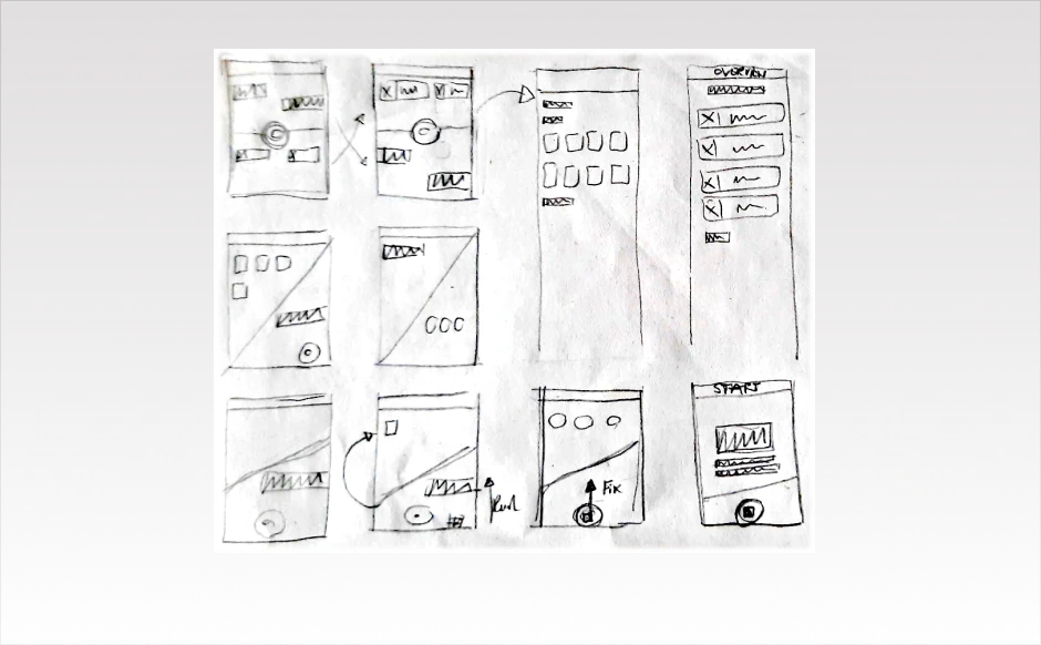
Sketch out ideas
Scribbles are ideal for initial ideas on the way to a design. They are simple sketches that help to develop ideas and clarify the structure and functions of individual pages. The advantage is that they can be created quickly and therefore many different ideas can be developed. There are hardly any graphic specifications in a scribble. This means that form and colour do not play a major role at this stage. Due to the imperfect scribble, there are no inhibitions to make changes and tackle new ideas.
Colour and font selection
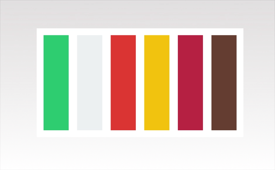
As the planned app is intended for food documentation, we looked for suitable colors in a food-inspired color palette. The following colors are available from left to right:
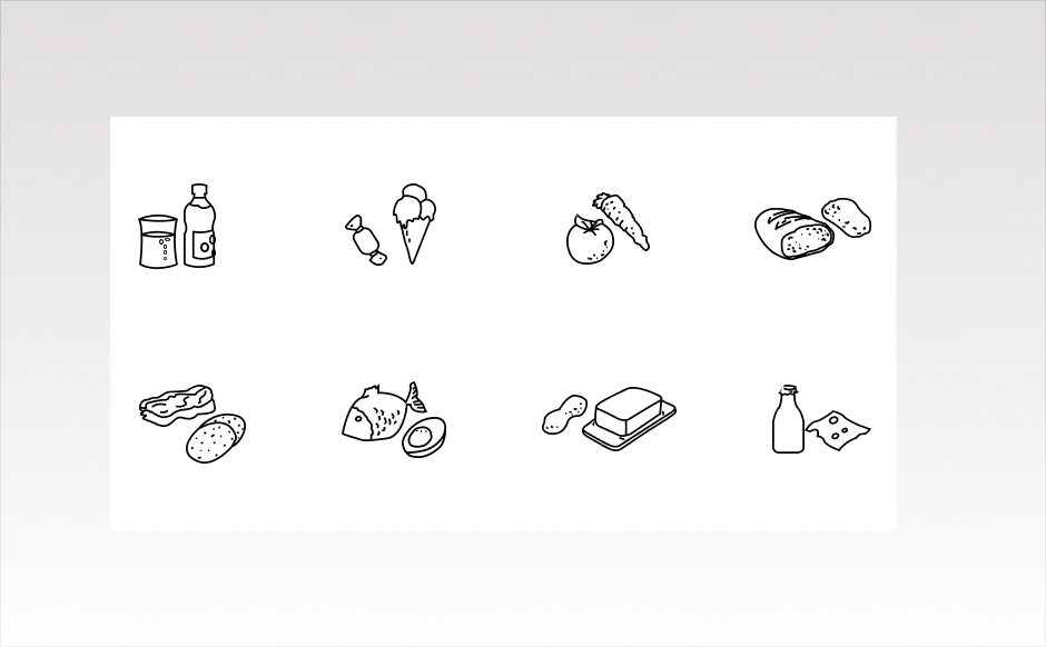
Cucumber green, milk white, tomato red, lemon yellow, raspberry pink, and chocolate brown. Because the entered food categories are already displayed in different colors, the app color selection itself should stay reduced in order to create calm and focus. The base color of the app is therefore milk white, while the main action elements use cucumber green and tomato red. For the different food categories, additional graphics of foods for the different categories were created to support them even more visually.
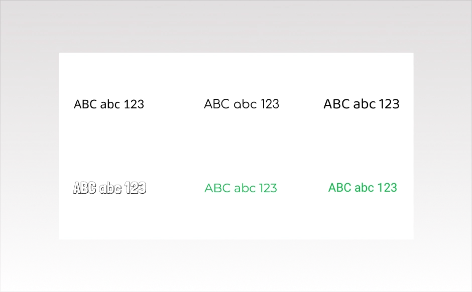
As with the colors, the typography also needed to be clear and simple. The fonts Montserrat and Roboto were therefore chosen. Roboto is used for the chat messages, the lists, and the overview of the recorded food. Montserrat is used for all other texts such as headings and longer passages in the app.
Result
The app feature that was the focus of the hackathon was a way to document consumed food and drinks via voice input. The design result of the hackathon consists of three screens containing the core functionality that was developed.
The start screen can be seen on the left. If the record button is pressed or swiped upwards, recording starts and the consumed food and drinks can be captured. If a voice input is not recognized or requires clarification, the system provides a prompt. If the food is recognized, it is listed at the top of the app and the previous chat history is cleared to make room for the next entry. If there is an error, the listed food can be deleted directly from the list. To end the documentation, tap the stop button. All entered foods are then displayed in an overview. The base color of the app is intentionally not too dominant, so that the recording function remains in the foreground and the screen does not feel overloaded with color once the food categories are listed. By enlarging the curved chat area as soon as an entry is started, a clear separation is created between the active communication area and the passive documentation area. This app has potential for further development. There are other useful functions in the pipeline that could be integrated here.
Julia Wollfarth
As a UI/UX designer, I am responsible for all topics related to design and user experience. I support our clients with my flair for intuitive user interfaces and charming design and color concepts. In my blogs I will give insights into my work, talk about UI/UX topics and take a closer look at design trends.
Modern applications are becoming more design-centric and therefore end-user-centric. For the user, the technical side of the program is not at all interesting, but rather taken for granted. Attractive design, animation and ease of use, on the contrary, all other things being equal, can make the application more popular among competitors.
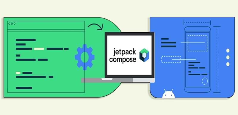
It's been almost two years since the release of the stable version of Jetpack Compose, but still many developers are skeptical about using this framework in their projects. To answer the question, is it worth using Compose in your projects, let's make a small comparison between Android Views and Jetpack Compose based on typical tasks when developing native Android projects.